bitcrush’d
Client: Student project
Challenge: Create a fictional restaurant with a full brand package and accompanying style guide.
Description: bitcrush'd is a traveling soda truck where you select a mix of syrups and toppings to create your own drink. Its retro style is based on arcade culture and early video games.
Visual Research
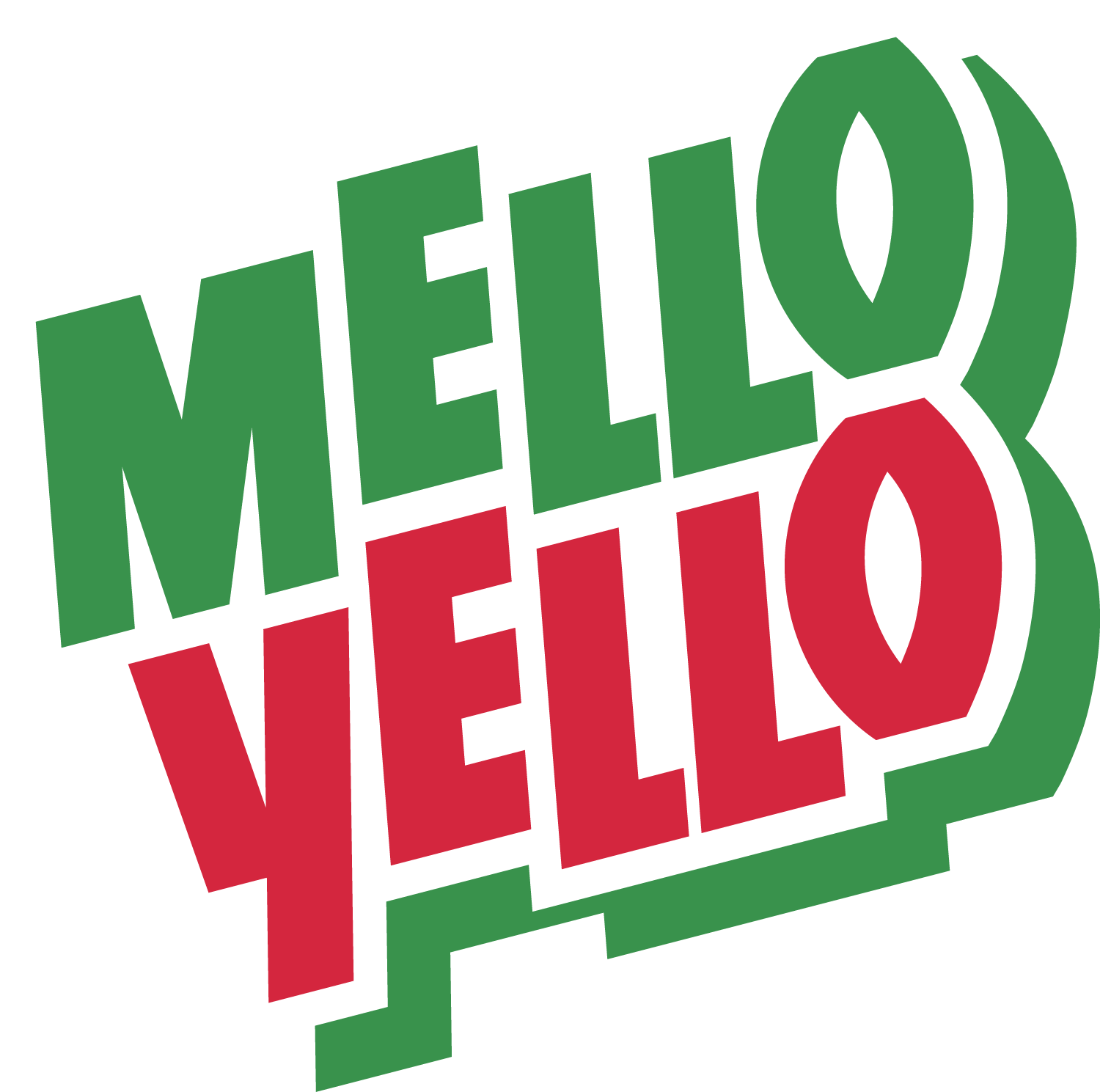
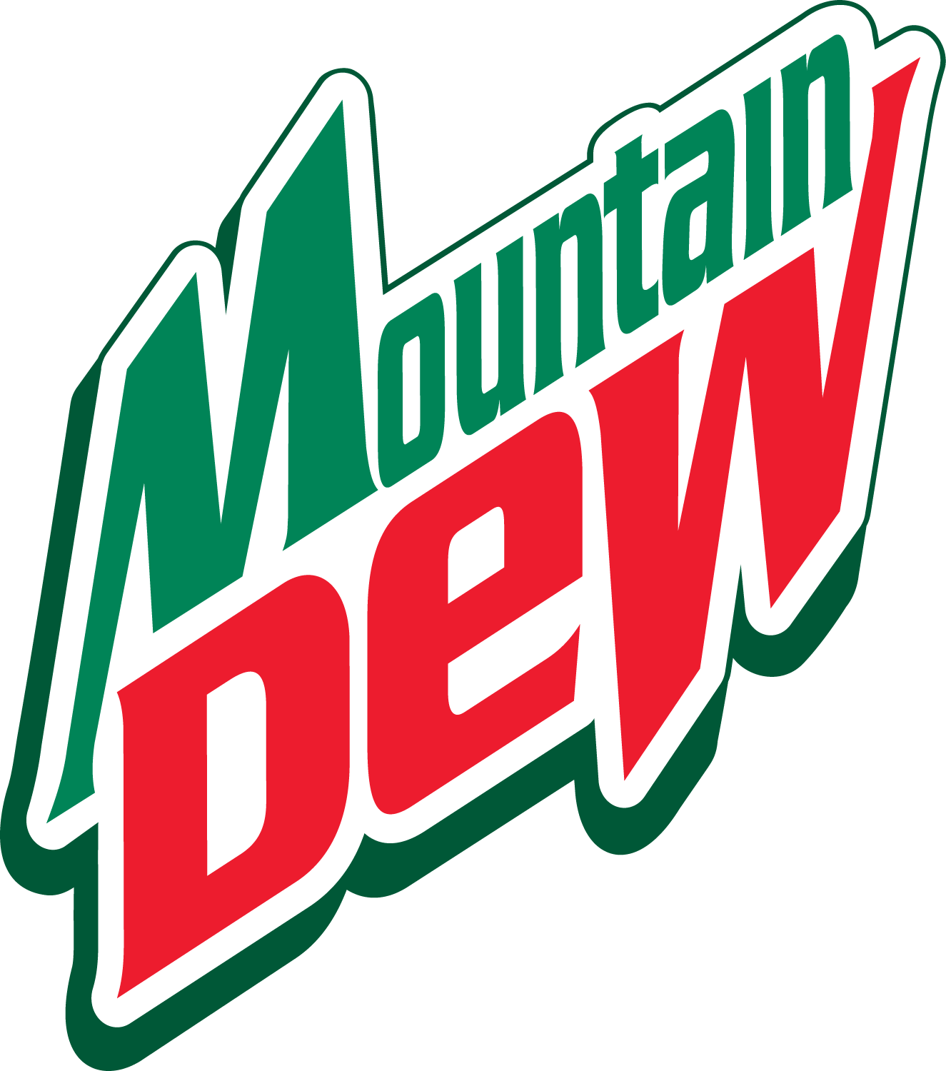
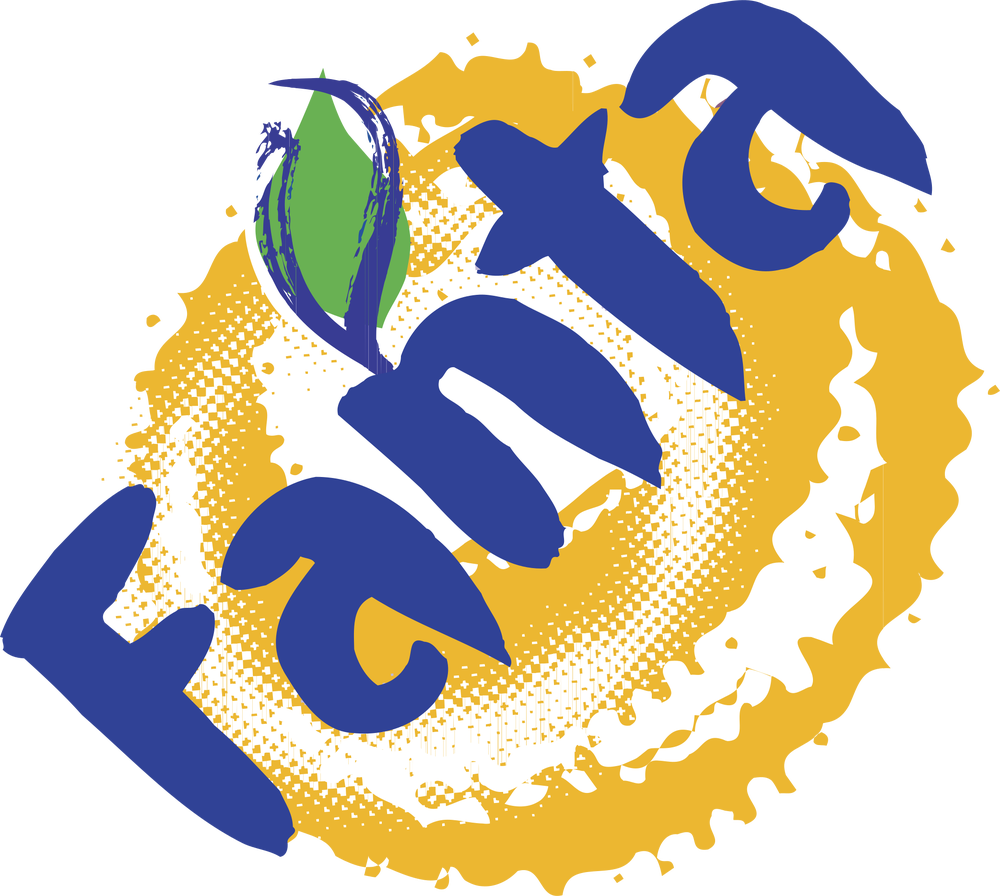
Starting with the logo, I examined soda brands from the 1990s to early 2000s to steer in that retro direction. Repeated traits I noticed were upward tilts, high saturation, multi-stroke outlines, and abstract shapes to accompany the wordmark, so I kept all of these in mind when developing my logo.
Logo Development
I wanted to fully commit to the pixelated identity, so I tried many pixel fonts until I settled on one that was readable yet low-resolution enough to easily see each square.
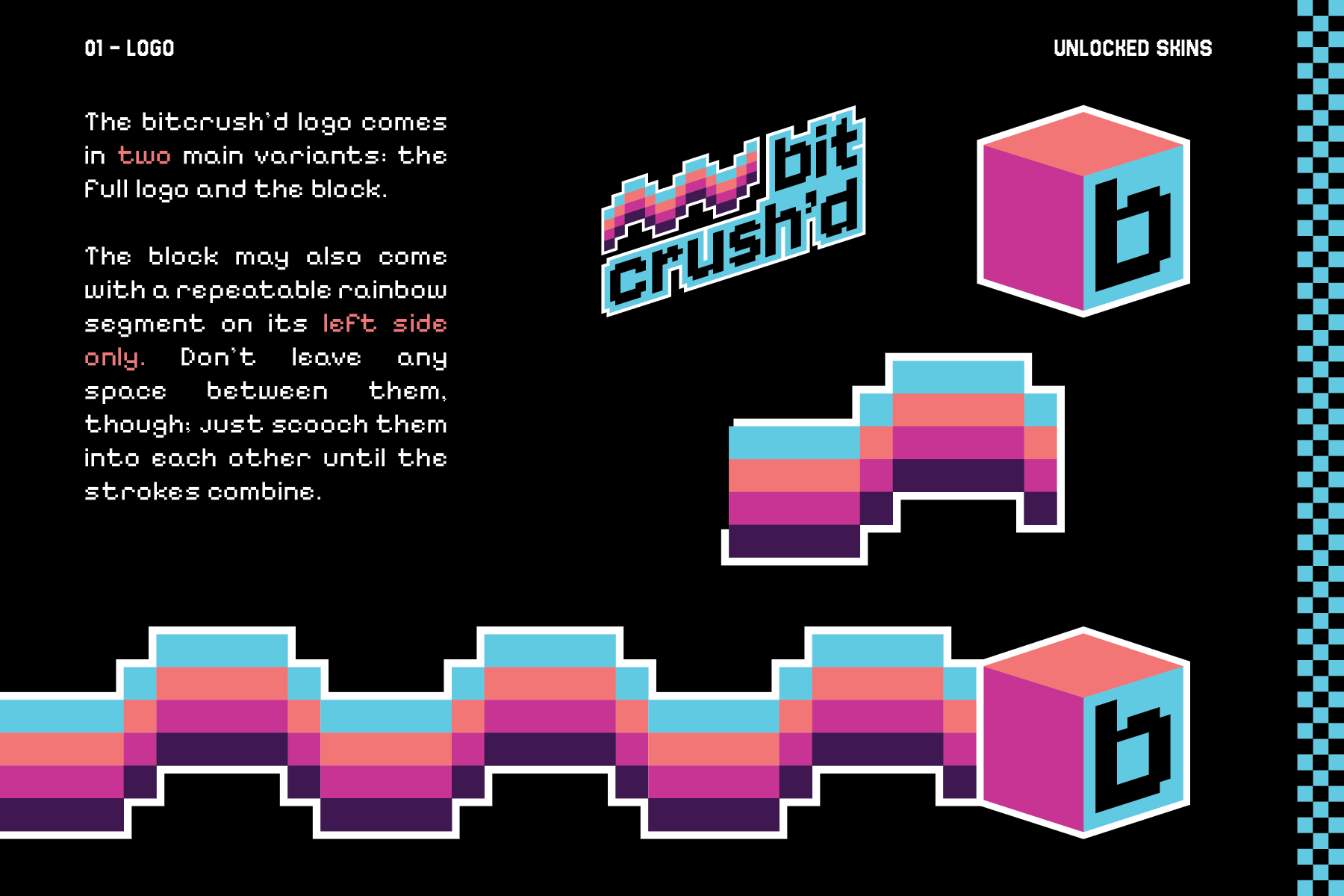
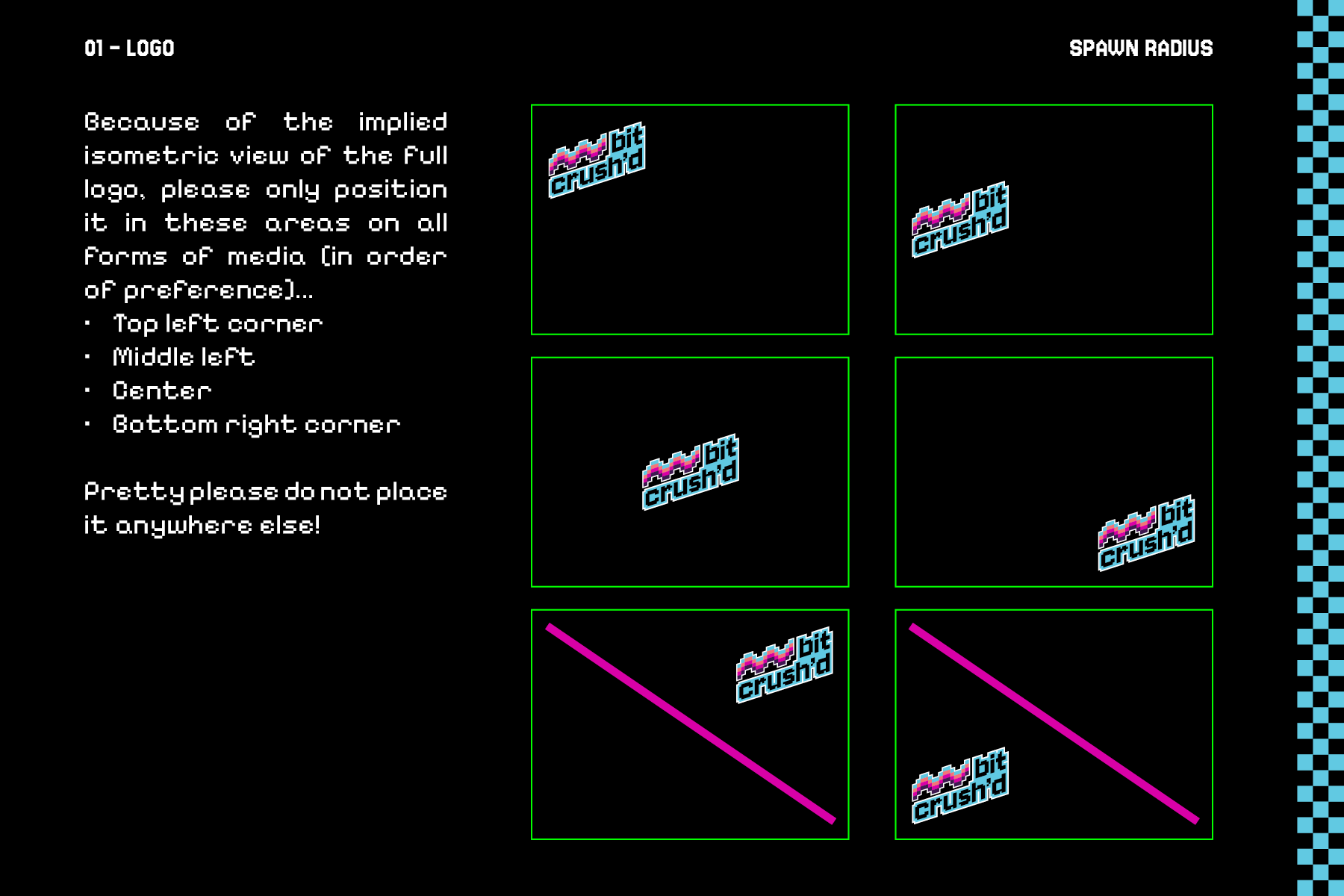
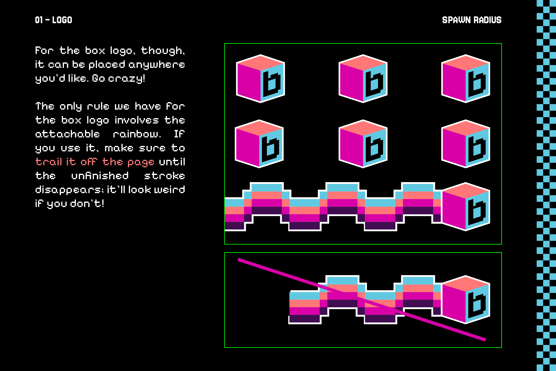
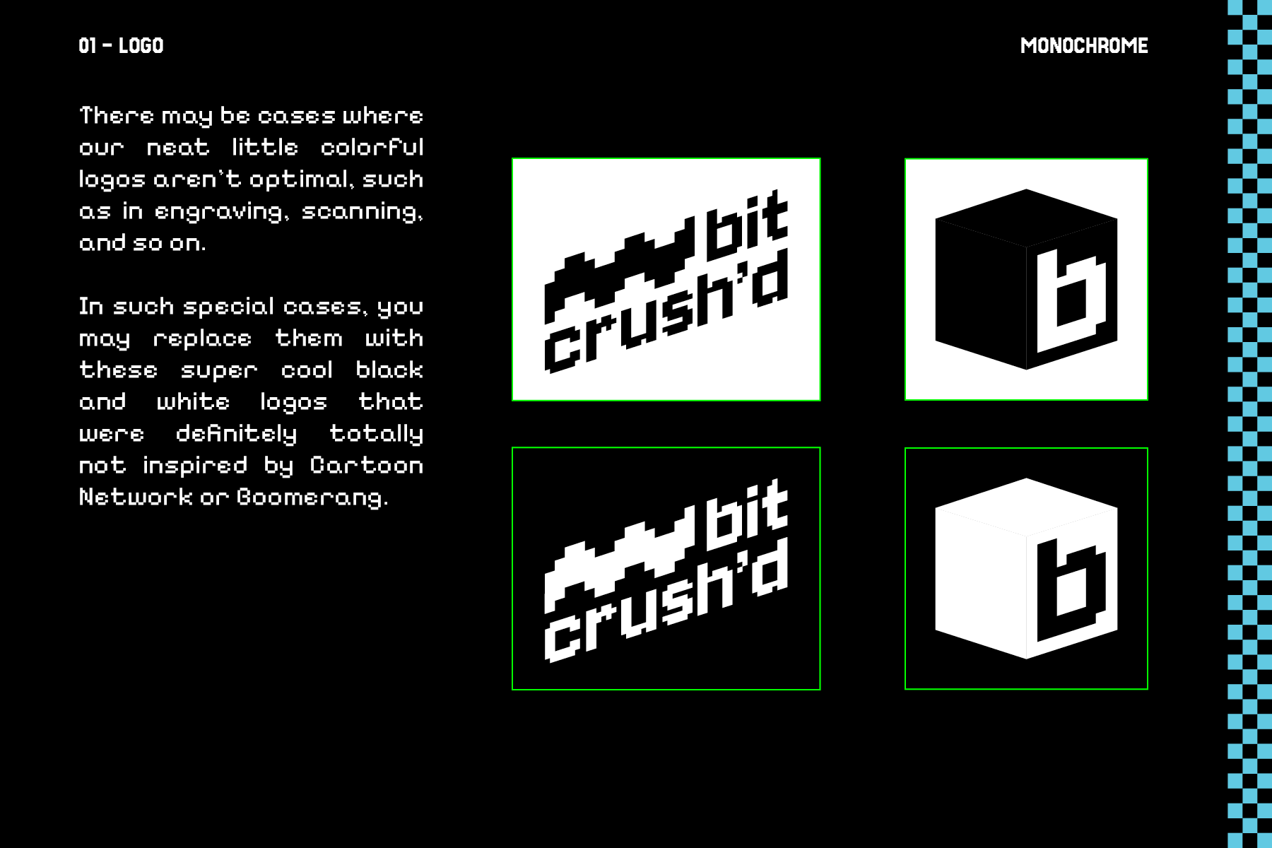
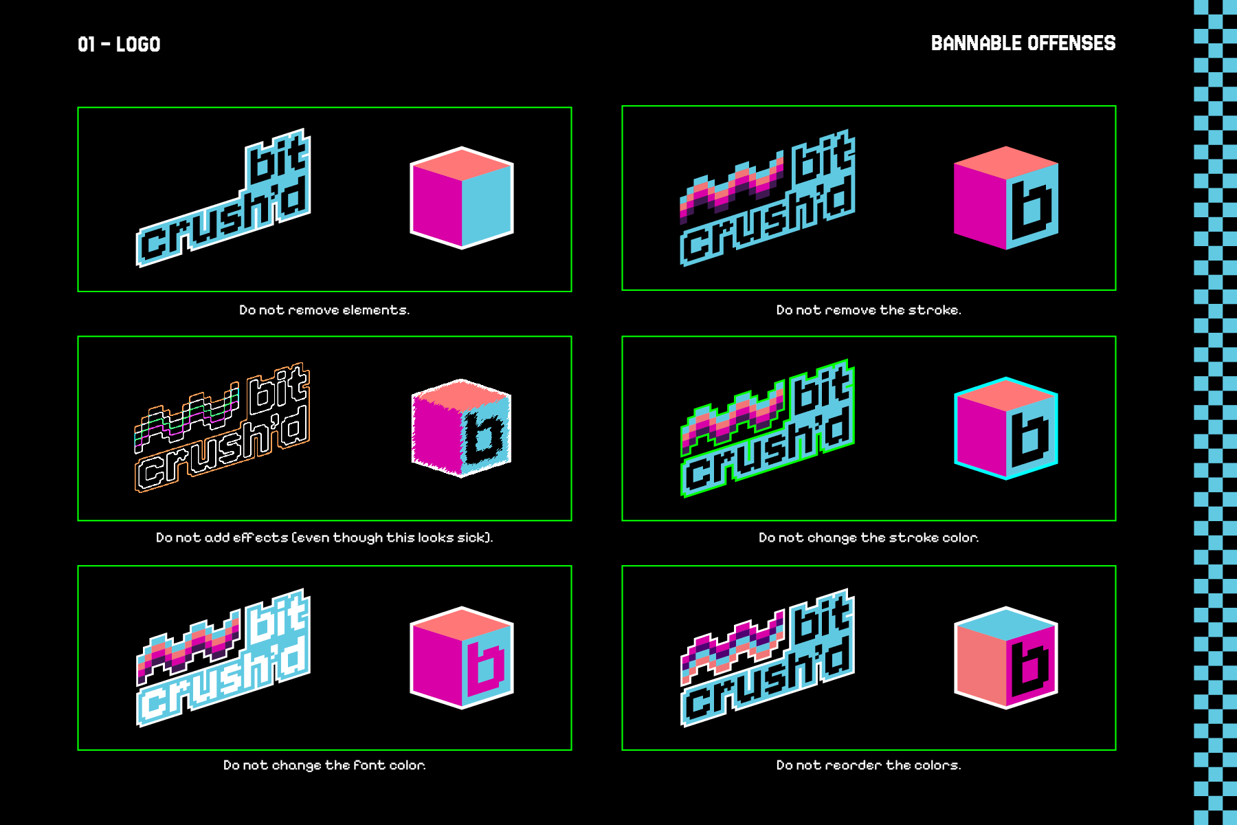
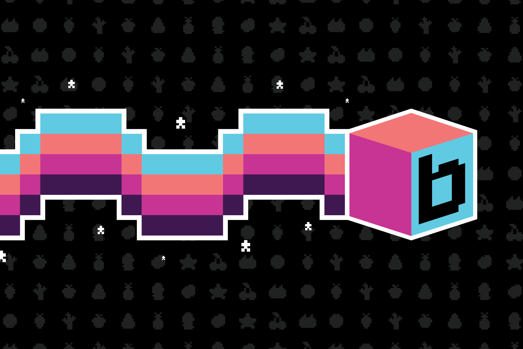
After that, I experimented with manipulating the characters until I found that skewing both mimicked the upward tilt of the old logos in my research, and gave an isometric look as if the word was on the side of a block—perfect for the theme! I ran with this and continued developing, spending lots of time on an additional, abstracted wave of soda to go along with the wordmark until I came to the final product. I designed a smaller, block version of it as well.
Collateral
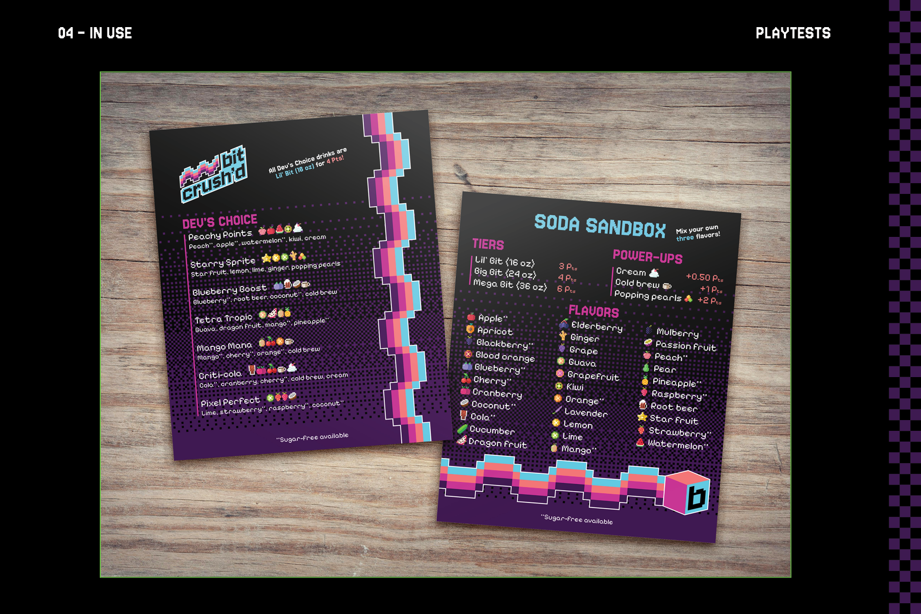
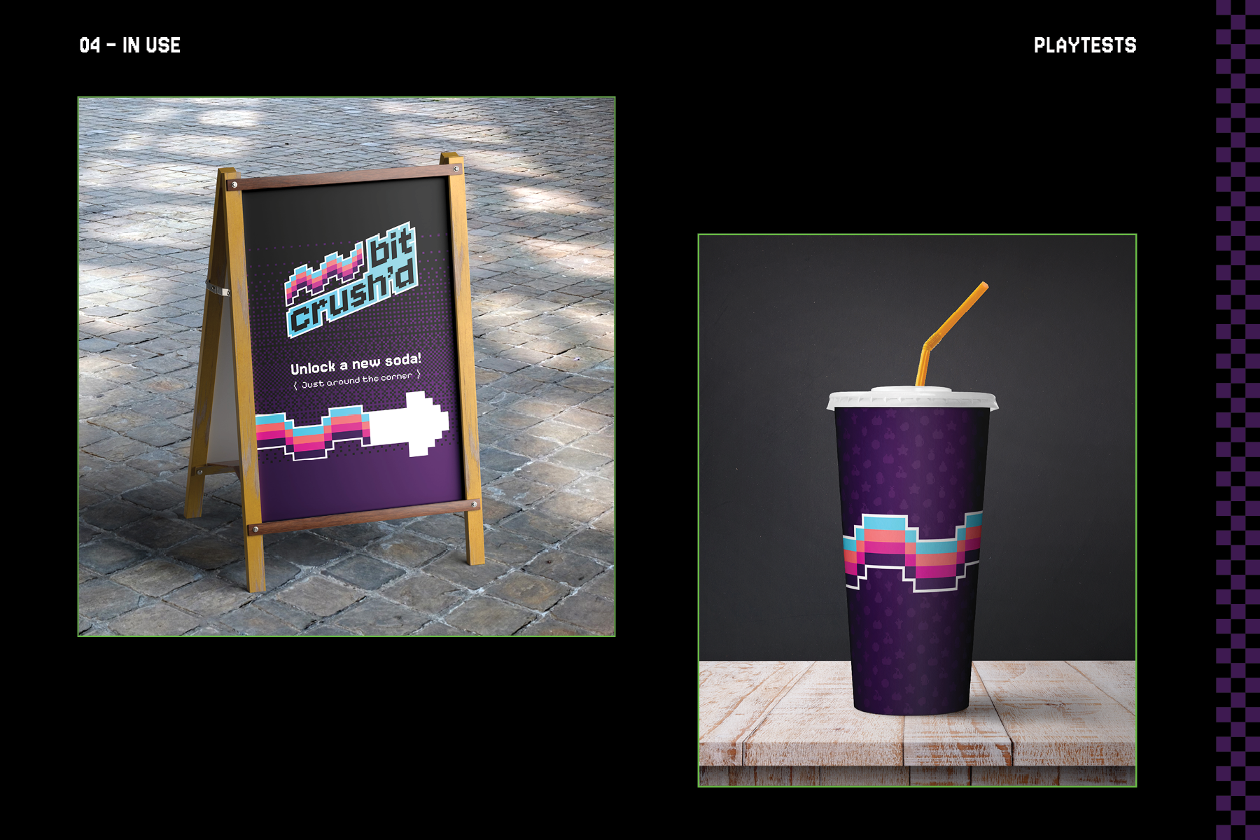
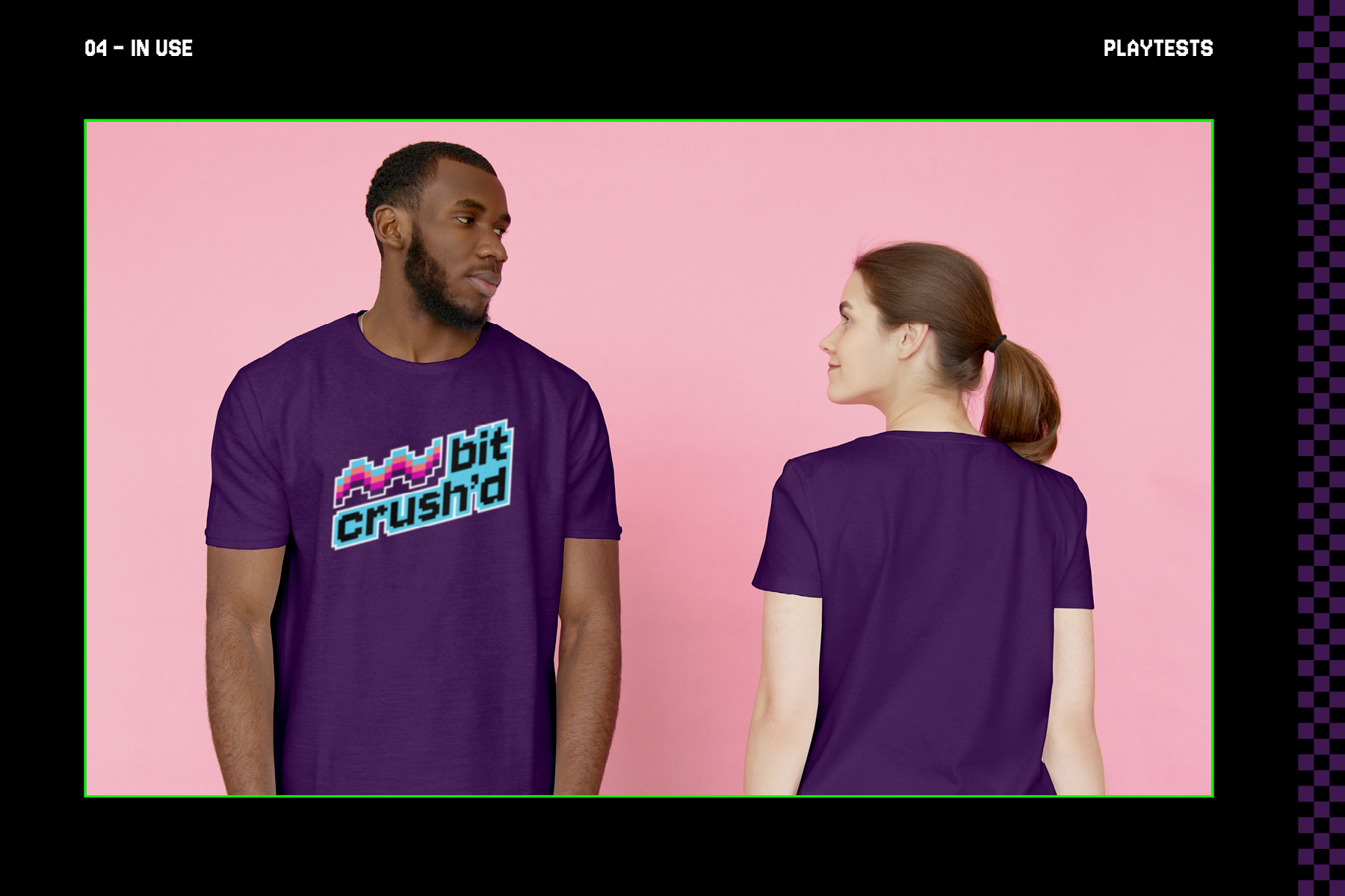
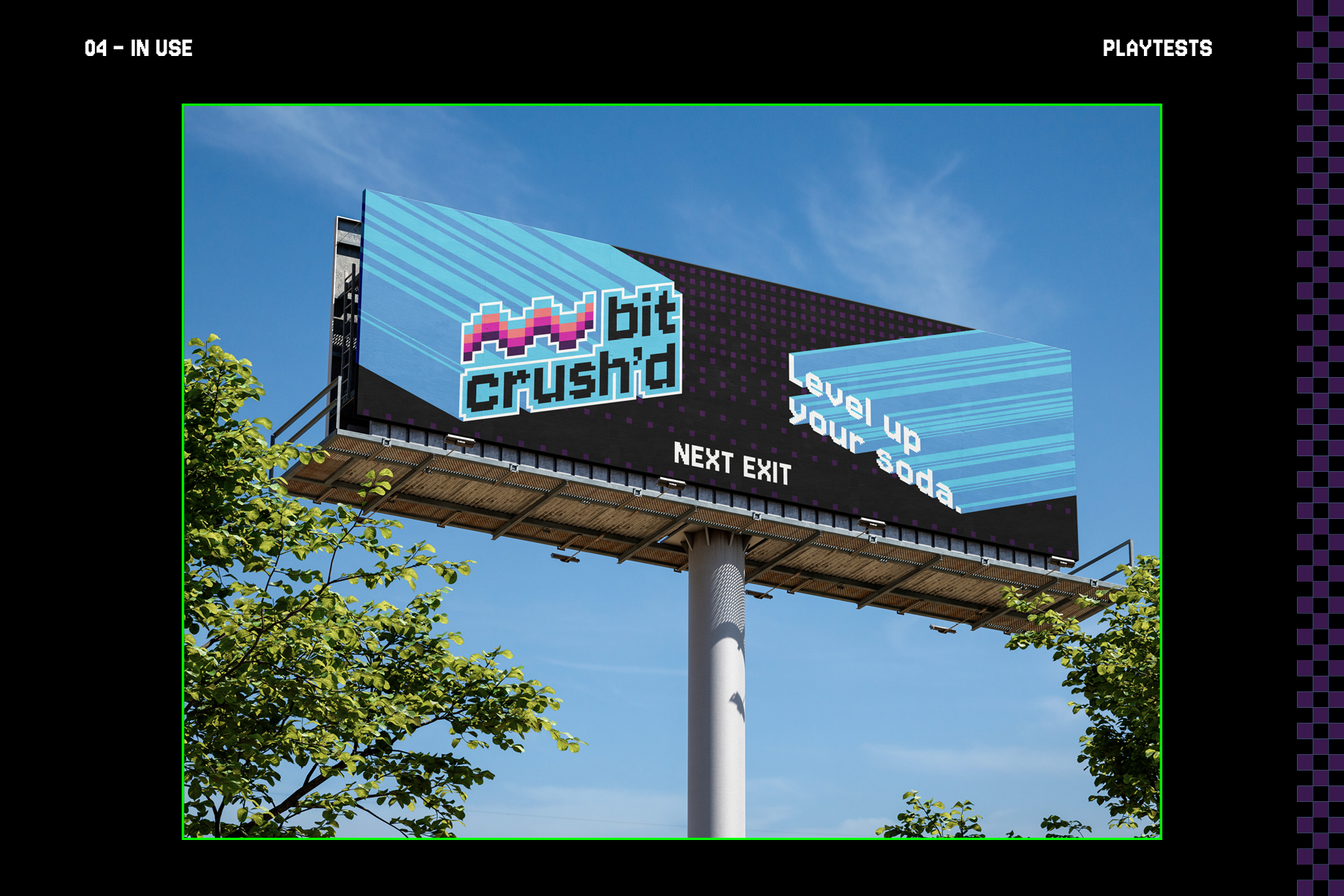
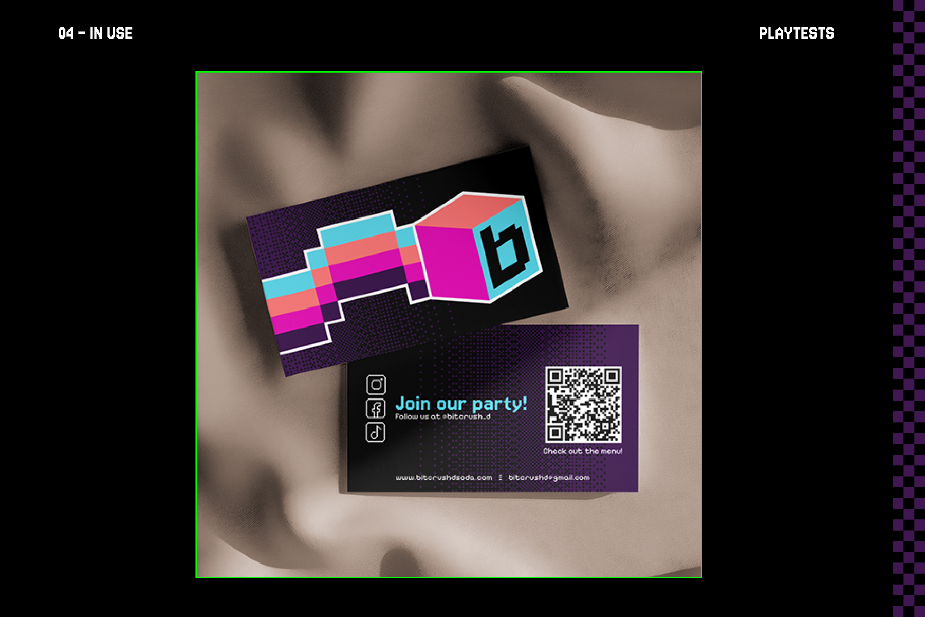
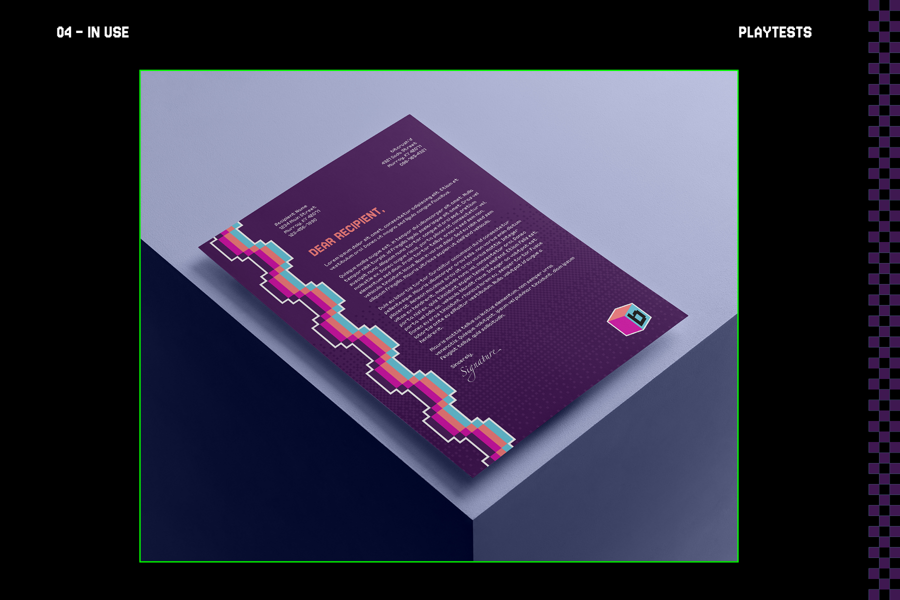
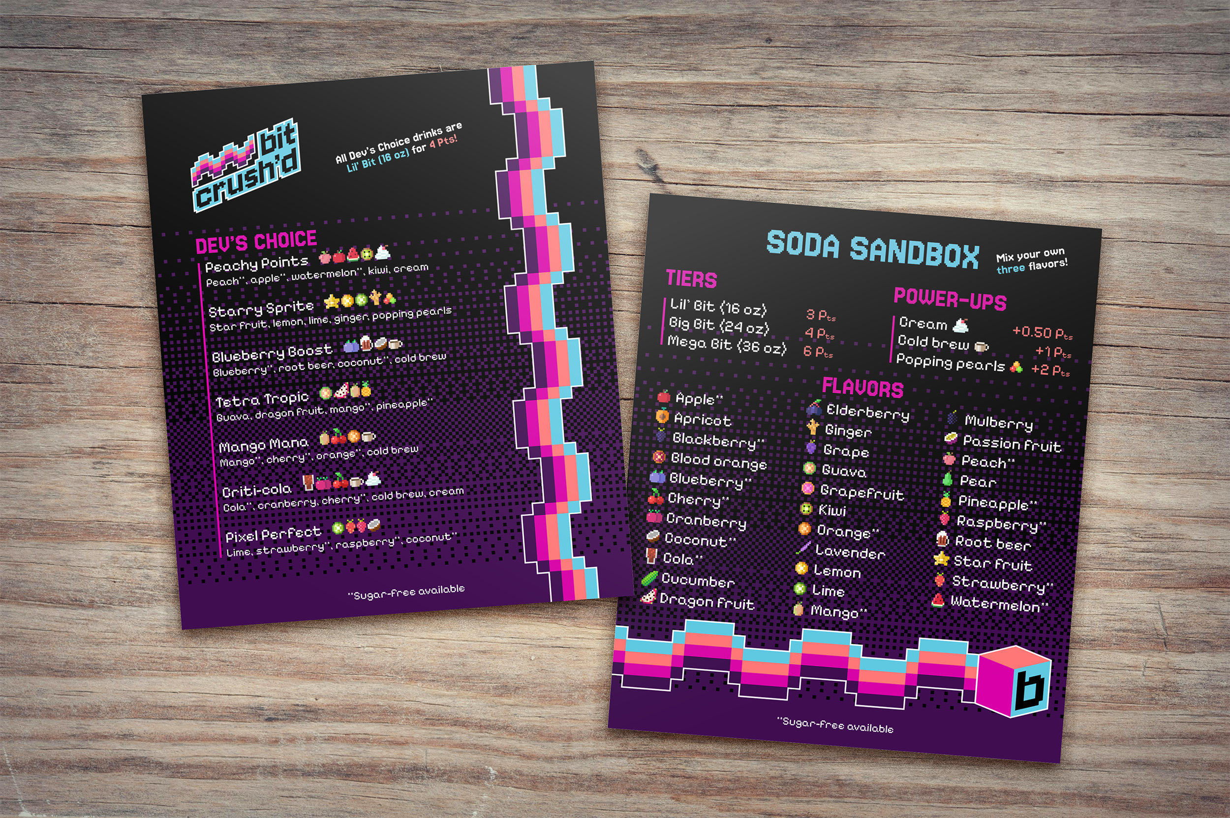
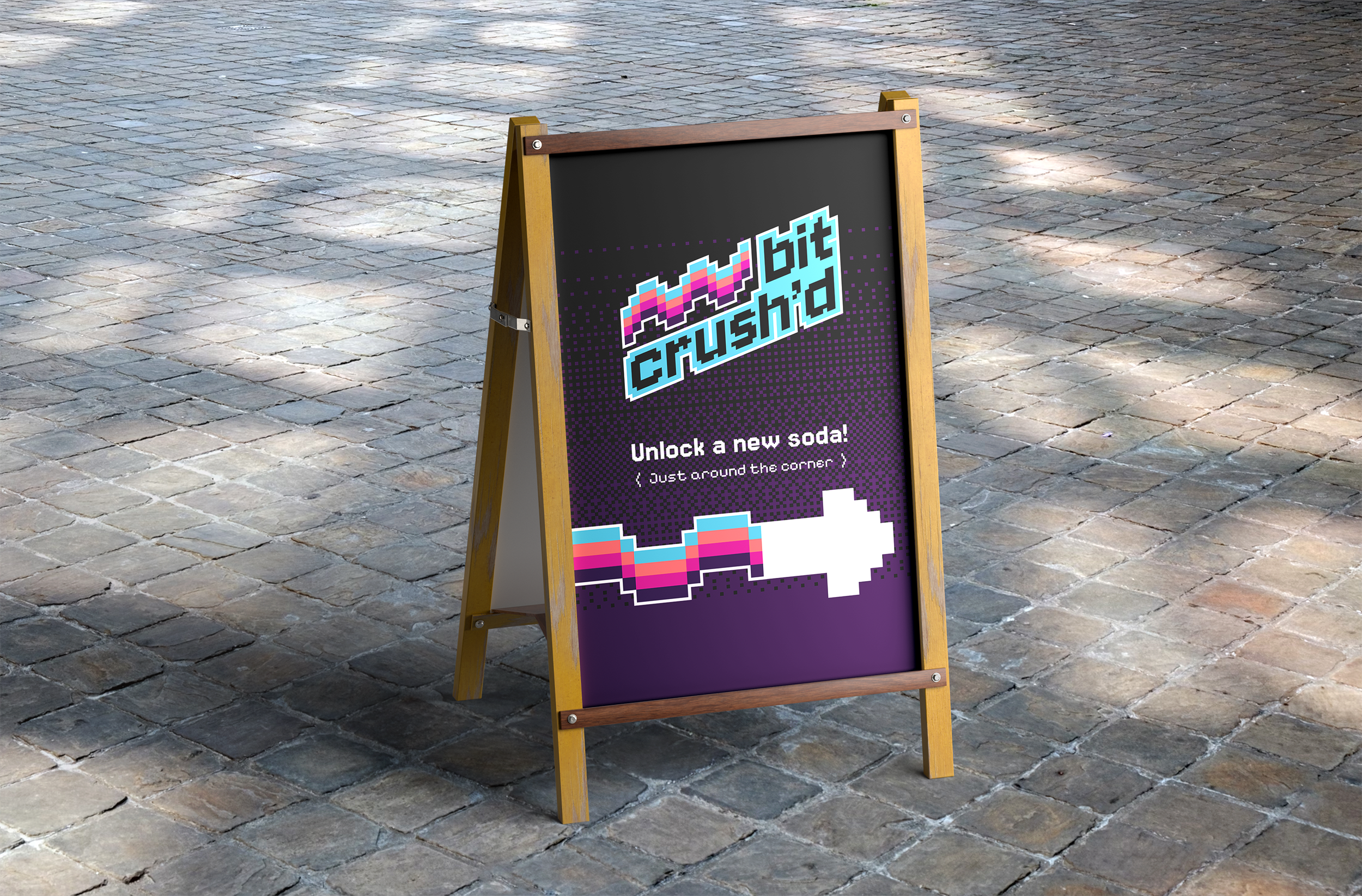
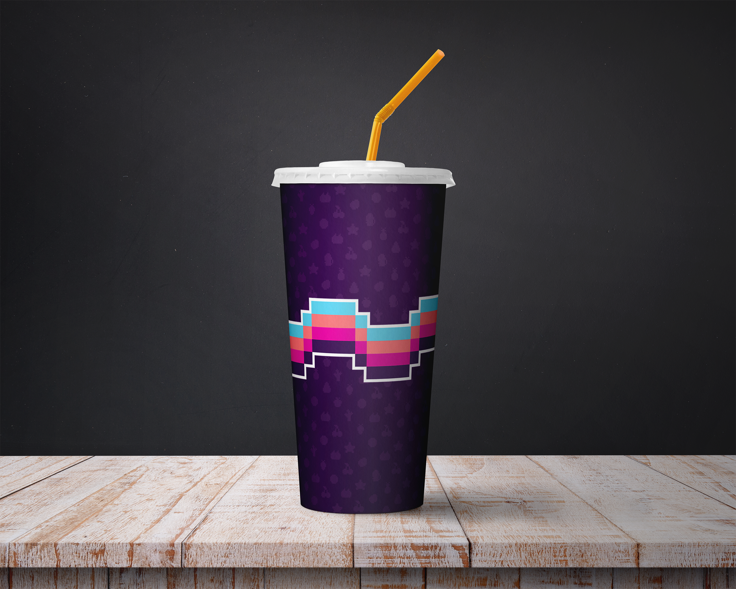
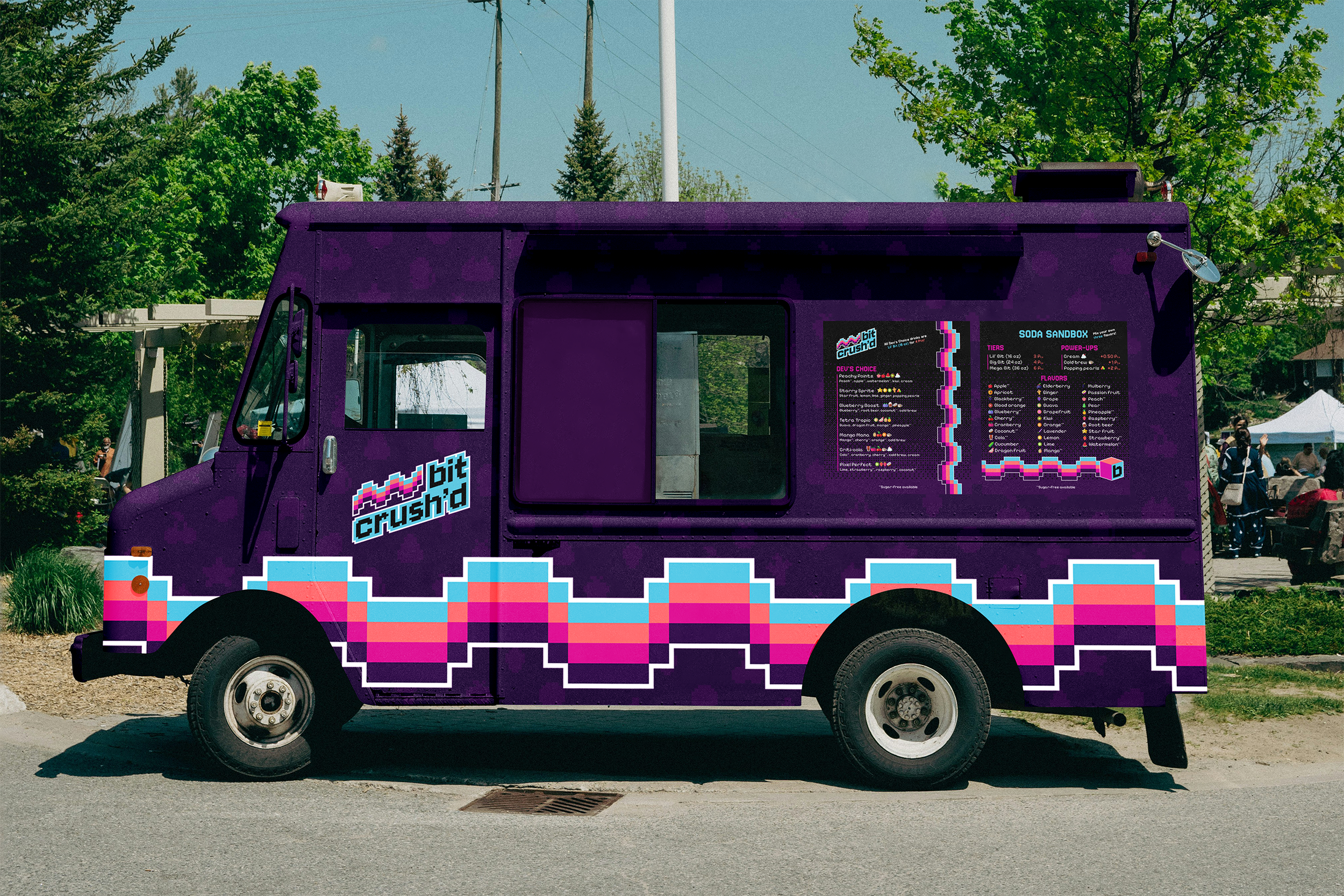
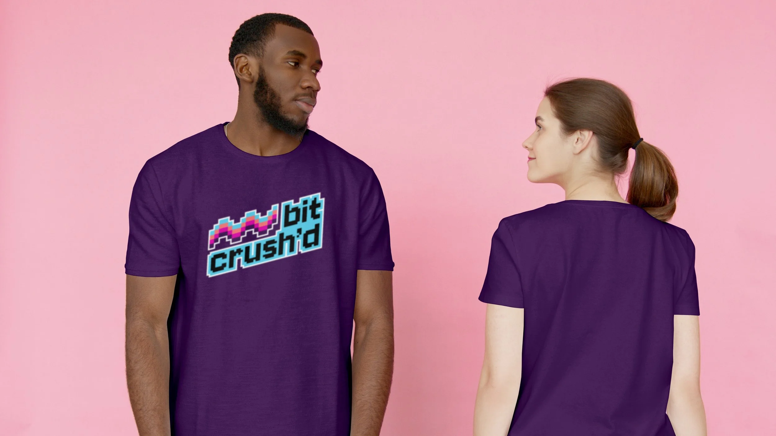
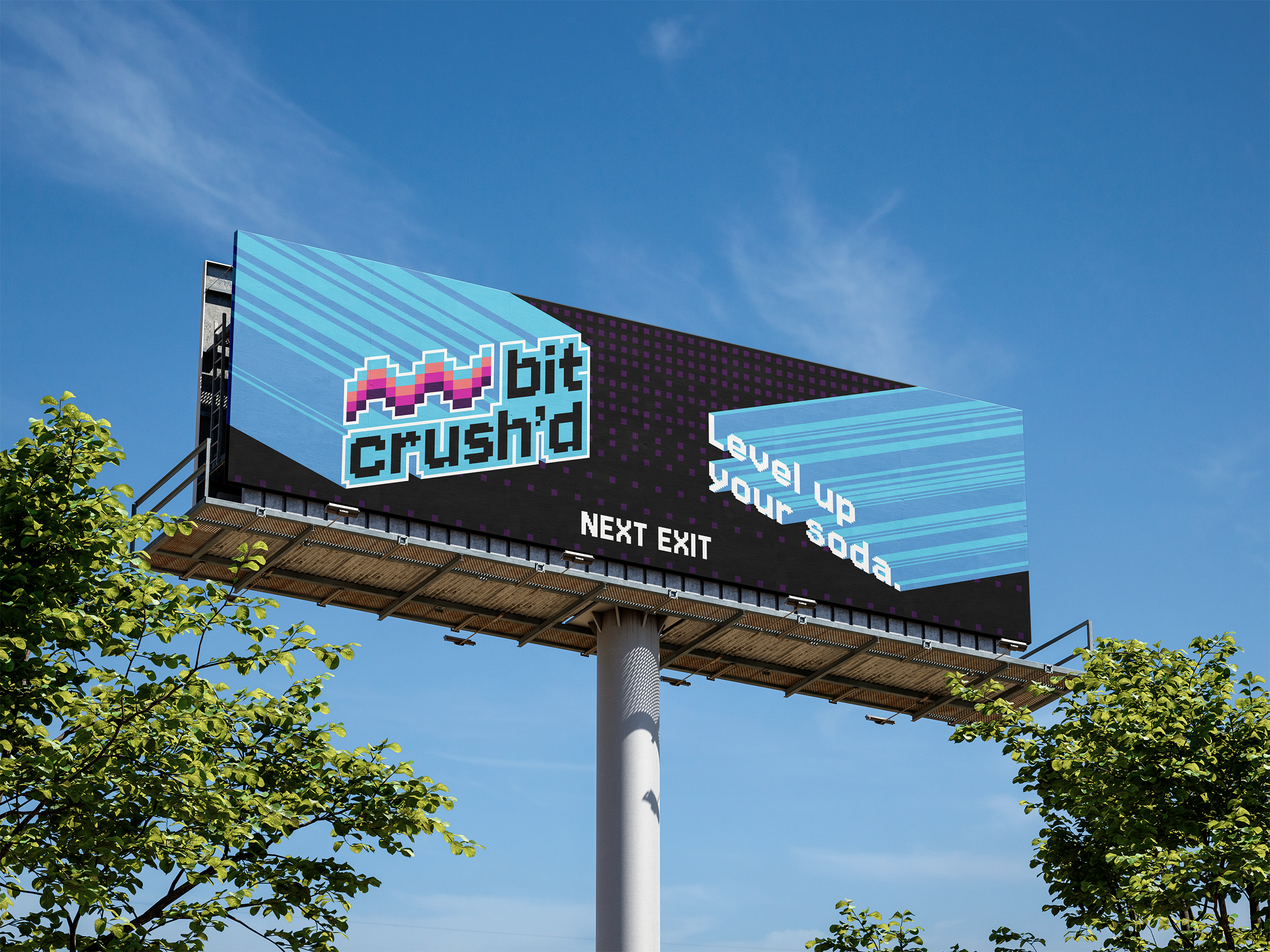
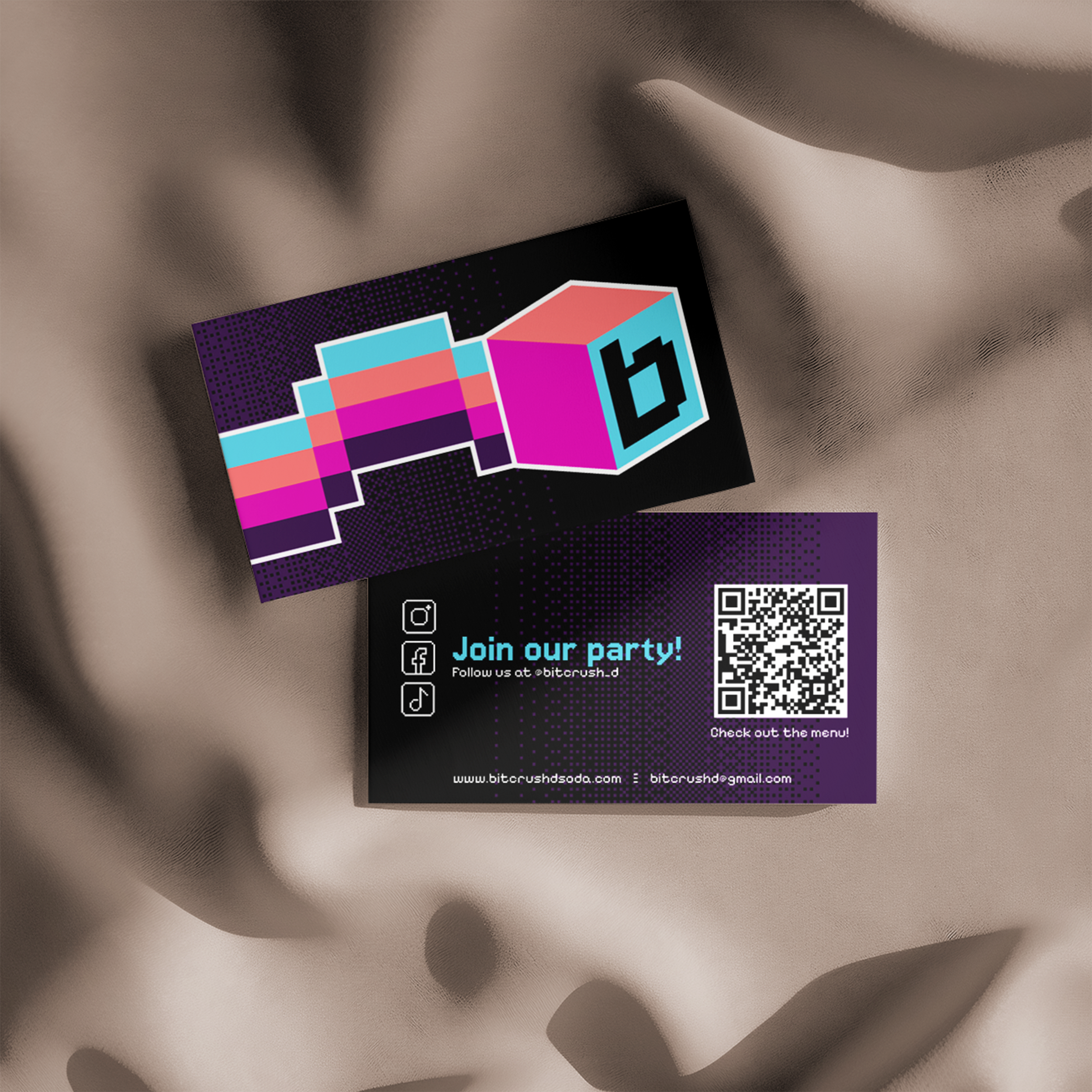
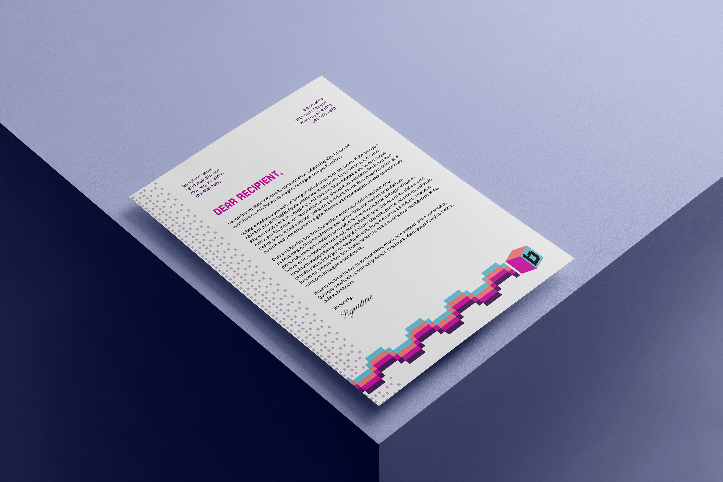
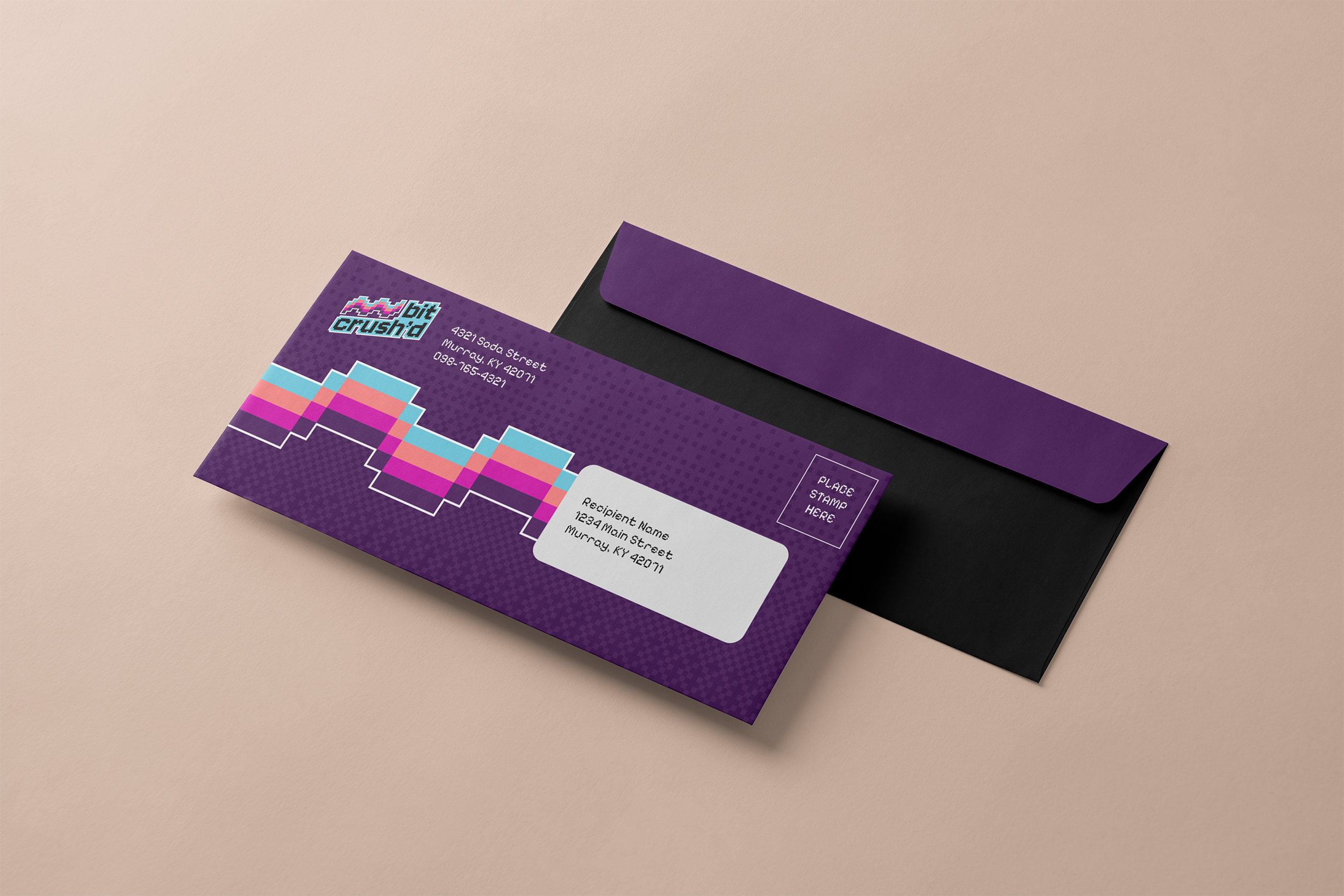
Plenty of mockups were required to further expand on the brand identity.
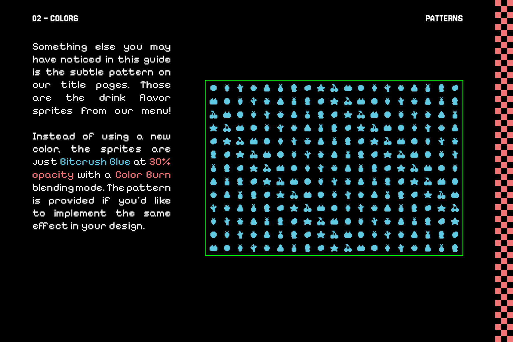
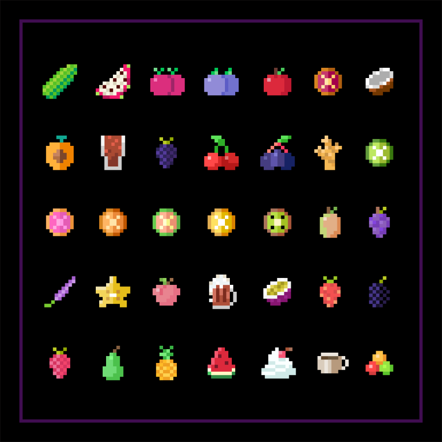
For bitcrush’d, I designed custom sprites for each flavor on the menu, as well as social media sprites for the business card.
Style Guide
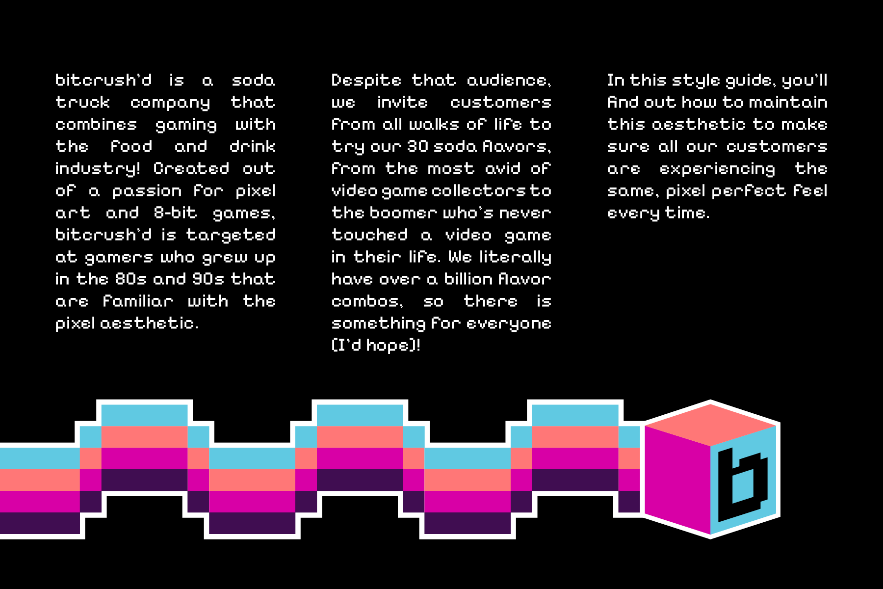
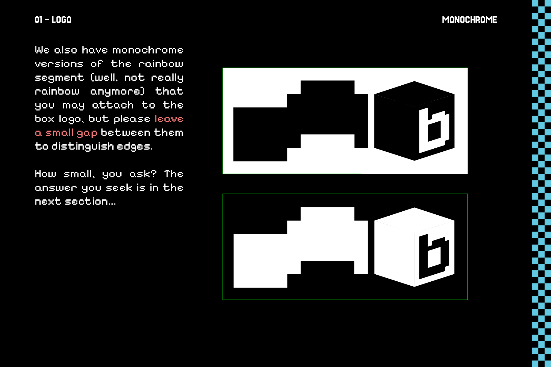
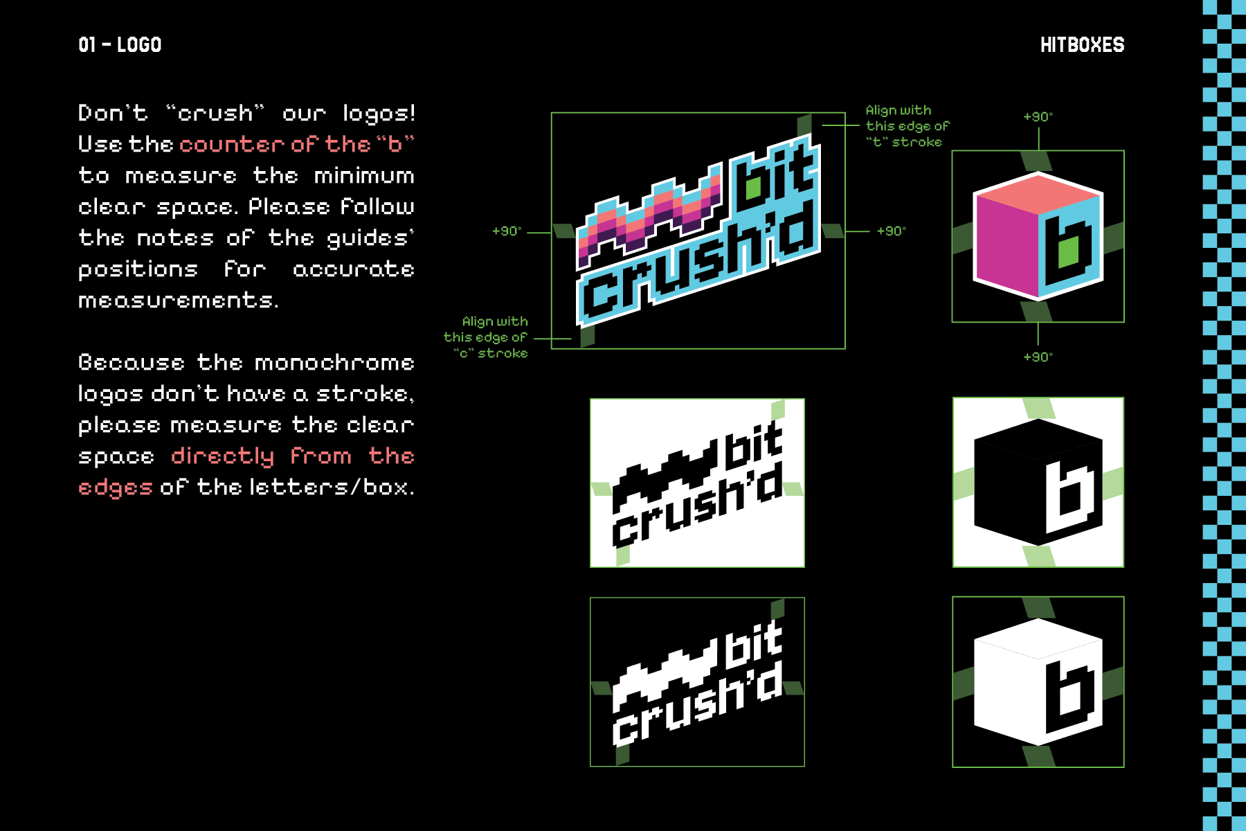
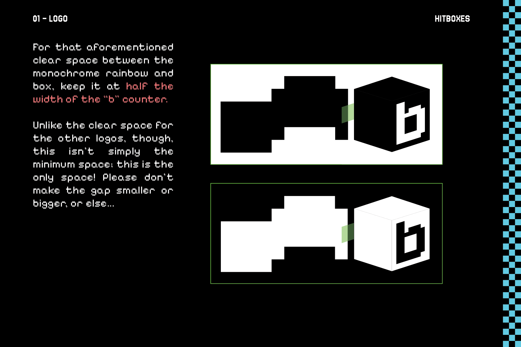
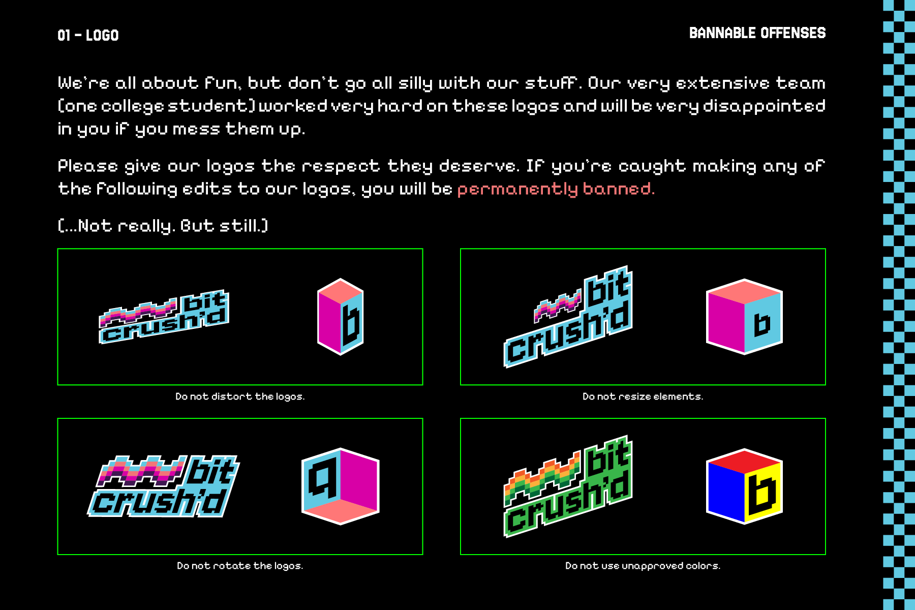
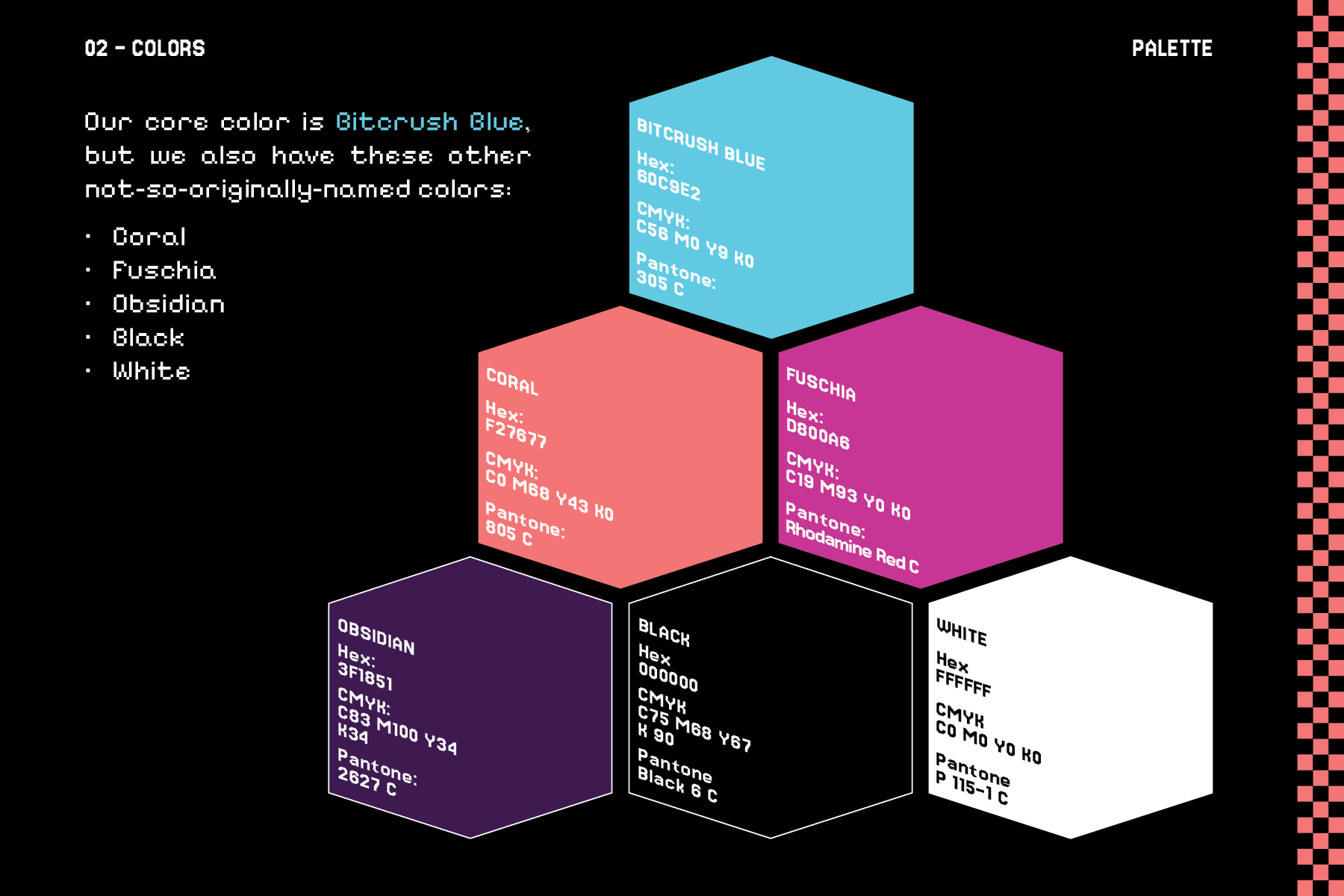
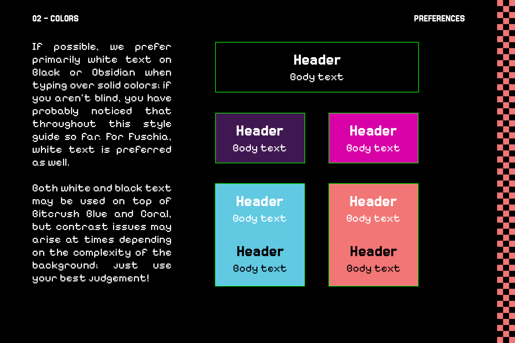
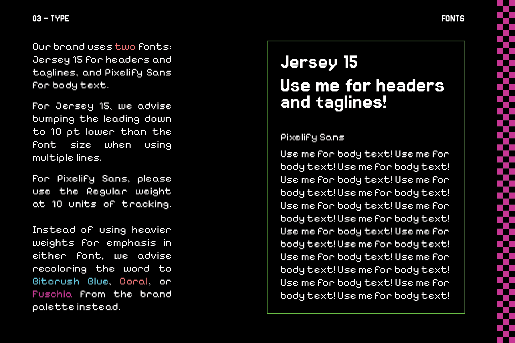
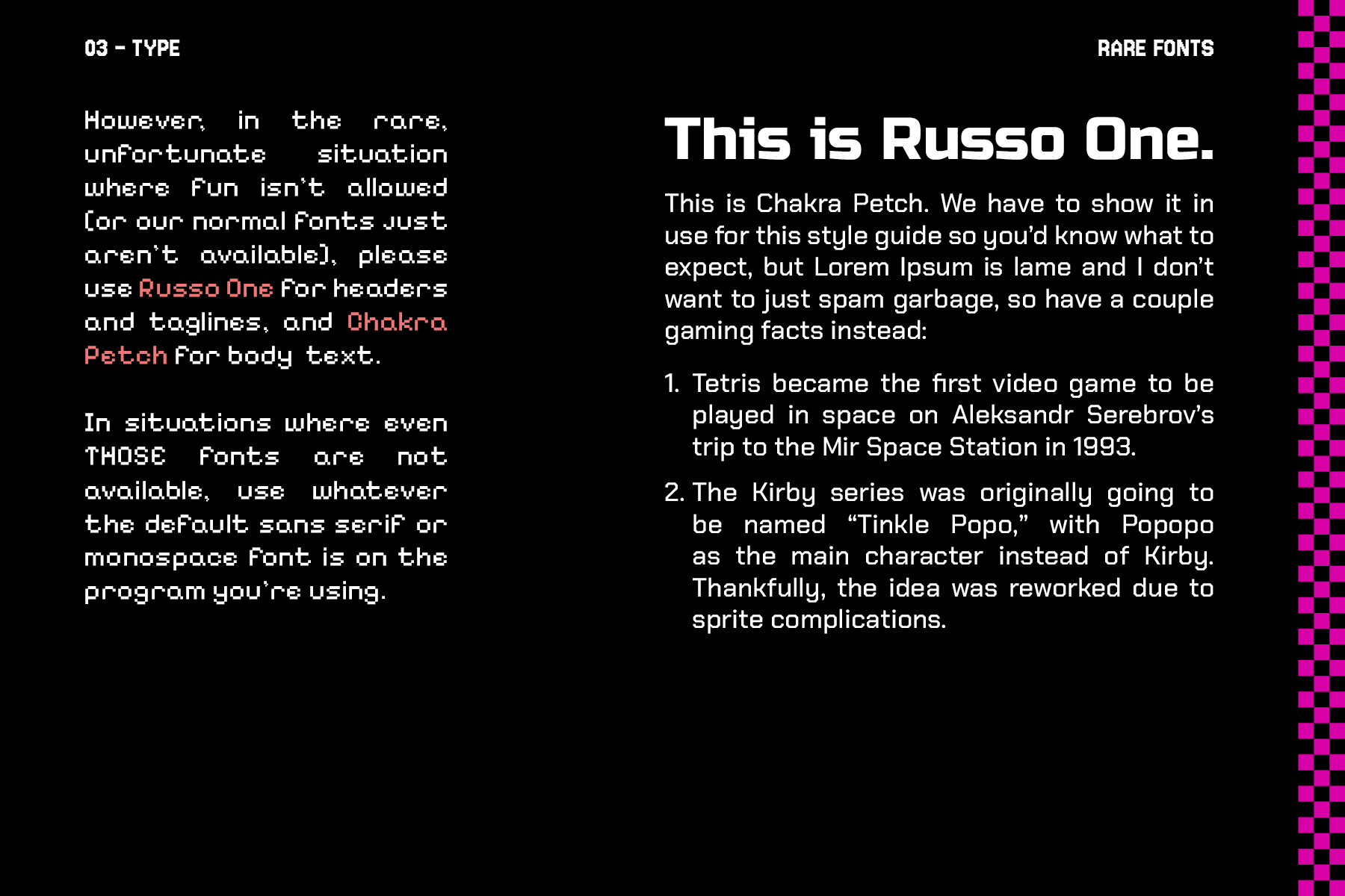
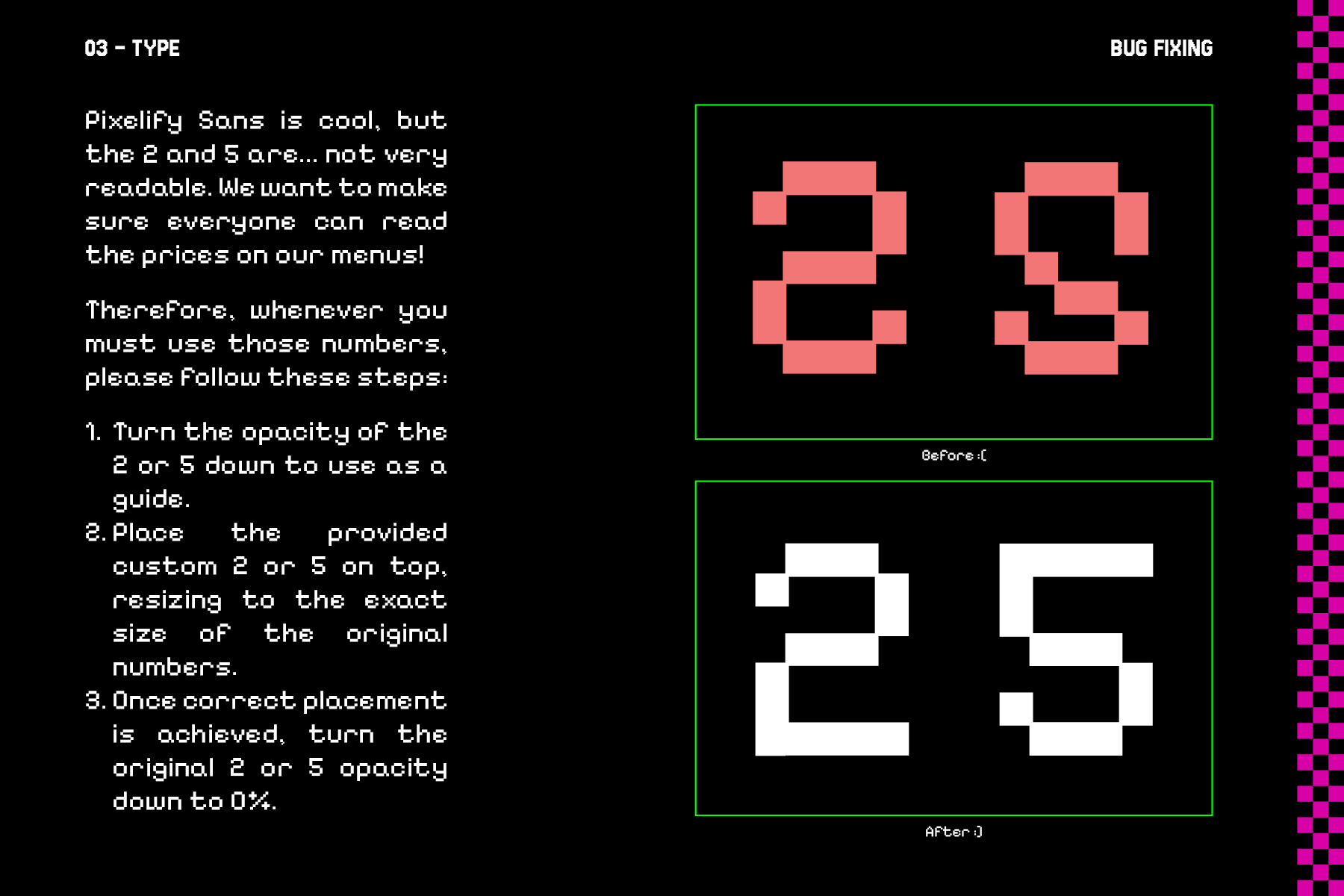
The final part of this project was to design a full style guide for the restaurant, which can be viewed below or opened in a new tab.
Arcades and the games within them are, of course, meant to be fun and inviting, so I decided to use a playful, conversational tone throughout to show that the brand doesn’t take itself very seriously. This is even present in most of the section headers, using game language instead of generalized terms to continue the playfulness.